
Web Design in High Demand in the Freelance Market
In the freelance market, there is a high demand for web designers. Many companies are willing to invest in providing an improved online experience for their customers, which includes both a visually pleasing appearance and user-friendly features.
Thus, it is crucial for web designers to stay updated with the latest trends and prioritize user experience (UX) in their work.
What is Web Design?
| Definition of Web Design

Web design involves designing, building, and managing internet websites according to their purpose. The scope of a web designer’s work includes the appearance of the website, layout, and even its content. Appearance relates to the colors, fonts, and images used, while the layout represents how the information is structured and categorized.
Designing a website is not just about making it visually appealing, it should also offer a great user experience and create a positive image for the owner, whether it is a company or brand.
The ultimate goal is to make it easy for users to find the information they need, and leave them with a positive impression of the brand, so that they are more likely to take actions such as making a transaction or participating in a campaign.
| Web Design Today
Desktop & Mobile/Tablet
In the earlier days of web design, websites were primarily designed for desktop browsers. However, with the advent of smart devices in the mid-2010s, more and more visitors started accessing websites on their smartphones.
As a result, designing websites that work well on mobile and tablet browsers has become increasingly critical. Consequently, many companies now focus on developing websites that function seamlessly on both desktop and mobile.
Responsive vs. Adaptive
Responsive Web Design (RWD) and Adaptive Web Design (AWD) are the two most common methods for creating websites that work well on both desktop and mobile. Responsive design automatically adjusts the content size according to the device being used, such as a PC, smartphone, or tablet. Adaptive design, however, sets website content to fit fixed layout dimensions for regular screen sizes.
Comprehensive Web Design Guidelines
1. Keep it Simple!
If there are too many unnecessary design elements (those with no purpose in terms of functionality), it can be difficult for visitors to achieve what they want. From the perspective of the necessary functions and User Experience (UX), ‘simplicity’ is not a choice but a necessity. It’s enough to have only the necessary elements on the page. How? Just follow the rules below!
| Tips for Simple Web Design

Color: Don’t use too many colors. It’s recommended to use up to 5 colors (±2).
Typography: The font should be easy to read. Avoid overly artistic or illegible fonts as they can harm readability. For font color, maintain a minimum amount of color and select one that contrasts well with the background for visibility. It is recommended to use up to 3 different fonts in up to 3 different sizes.
Graphics: Use graphics only when they help users perform a specific function or complete a task. (Don’t add without any purpose)
2. Maintain Visual Hierarchy
Visual elements also have a hierarchy, which means certain elements should be given more emphasis and arranged in a specific order for visitors.
By adjusting the position, color, or size of specific elements, you can design a website that attracts users to those elements first. The goal is to optimize a good user experience while leading visitors to take the action the brand (or website owner) wants.
Let’s compare with the following examples.
| Examples

Example 1) Spotify placed a Call To Action (CTA) for registration and subscription at the top of the landing page for the premium category.

Example 2) Apple placed a large image emphasizing a new product and a CTA to induce purchase at the top of the main page.
3. Easy Navigation
To help website visitors find what they need easily, it’s crucial to create user-friendly navigation. Poor navigation is when users struggle to find the search bar, categories, or search filters, making it challenging to decide where to click next. Therefore, your goal is to design smooth navigation that allows visitors to move seamlessly from point A to point B. Follow these tips to optimize your site’s navigation.
– Keep the basic navigation structure simple(Recommended position: Near the top of the page).
– Include a navigation bar at the bottom of the site(footer).
– Consider using breadcrumbs on all pages (excluding the homepage).
– Including a search bar at the top of the site allows visitors to search by keyword.
Note | Breadcrumbs
Breadcrumbs are a feature that lists the links of previously visited pages horizontally at the top of a web page, allowing users to easily enter a specific previous page. This allows the user to identify their current location within the website and easily move to pages of higher categories.
4. Maintain Consistency
Having a consistent “look and feel” in a website is essential for a good user experience. This means keeping backgrounds, colors, fonts, and text tone consistent across all pages. When the layout is the same on all pages, like in the ‘Help’ section, users can easily find the information they need even when moving between different subcategories within the section.
5. Responsive is the Trend
Statista reports that more than 55% of all web traffic now comes from mobile devices like smartphones and tablets. The percentage is even higher for page views in the Asian market. The implication is clear: in order to offer a top-notch user experience, your website needs to be compatible with the diverse range of devices that visitors use.
Consider ‘responsive design’, where the size of the content automatically adjusts so that the screen changes to fit the dimensions of the device the visitor is using. This is an investment in optimizing the user experience by providing a flexible website structure!
6. Keep Up With the Trends
As a web designer, you need to be familiar with basic principles and the latest trends. Drawing inspiration from other designers and staying updated on web design trends will enable you to present competitive work results in collaborations with various clients.
For inspiration, check out the following recommended sites for web designers. (Note: The sites are not listed but they could include resources like Dribbble, Behance, Awwwards, etc.)
It’s important for designers to keep up with the constant changes in technology and internet usage, as well as the evolving behaviors and expectations of users. This ensures that designs will effectively connect with the target audience and meet their requirements.
Top 4 Web Design Reference Sites
1. Behance(https://www.behance.net/)
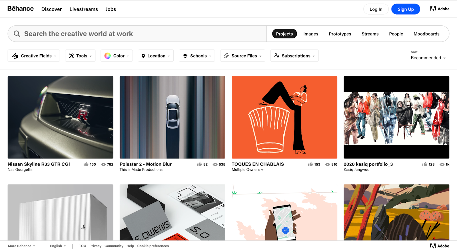
Behance is an Adobe portfolio-sharing service and is considered one of the largest creative communities globally. It is a platform where web designers worldwide can draw inspiration from excellent works and share their own creations. Although it is an international website, it supports multiple language settings.
2. Dribbble(https://dribbble.com/)
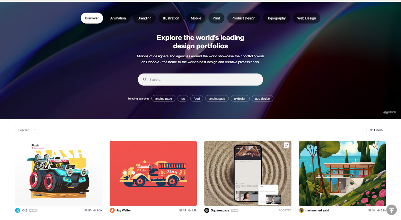
Dribbble is another international website widely used by designers and agencies around the world. It is a design-focused social networking and portfolio-sharing site. If you come across a piece of work you like, you can check the author’s information and communicate with them directly.
3. Awwwards(https://www.awwwards.com/)
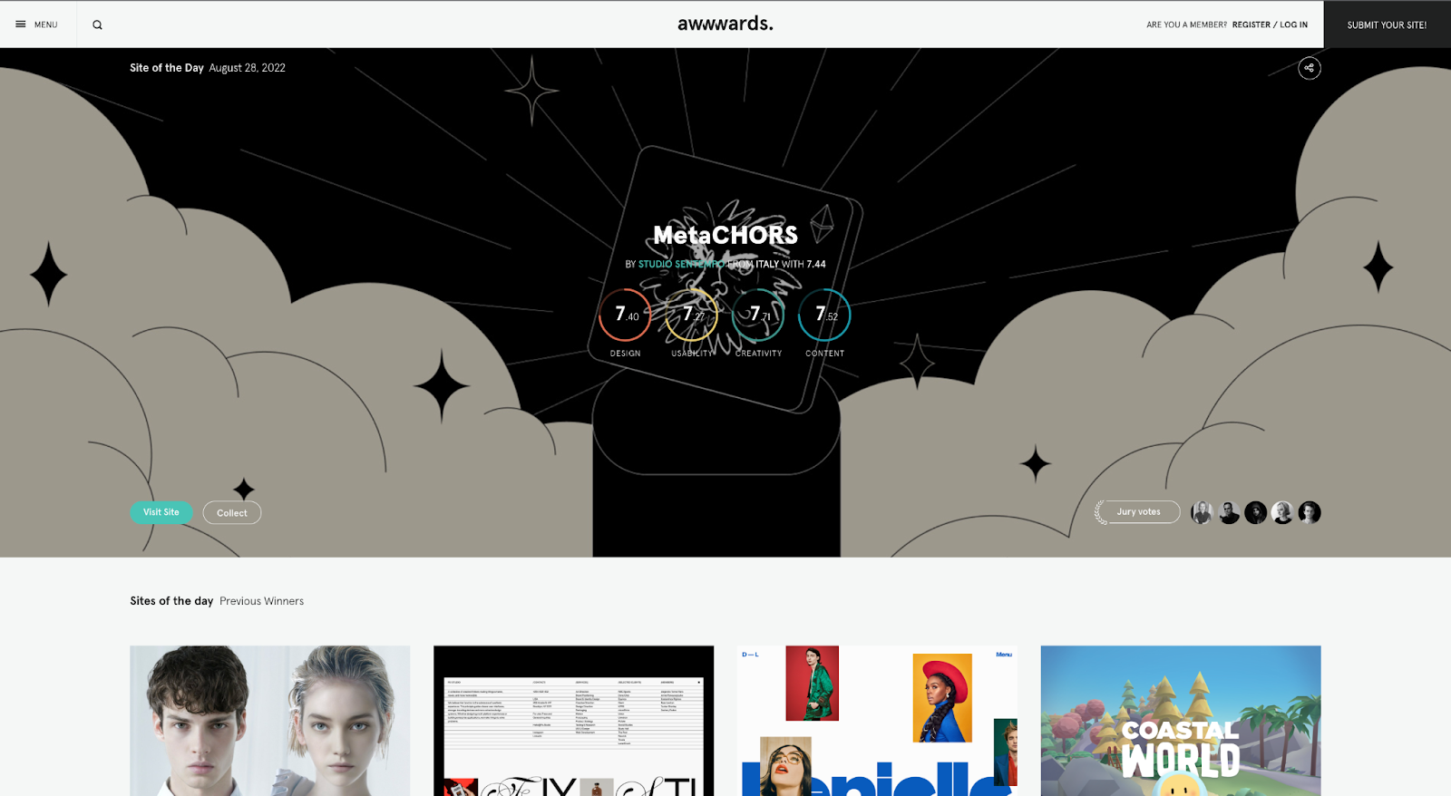
Awwwards is an intriguing international design website that features the ‘Site of the Day‘ on its main page. It selects web expert jurors who grade each site on design, usability, creativity, and content, then adds up the scores.
The scoring system is comprehensive! The scores from the general community members are also displayed on the detail page. If you’re looking for a curation-style site that spotlights excellent works, consider Awwwards.
4. SiteInspire(https://www.siteinspire.com/)
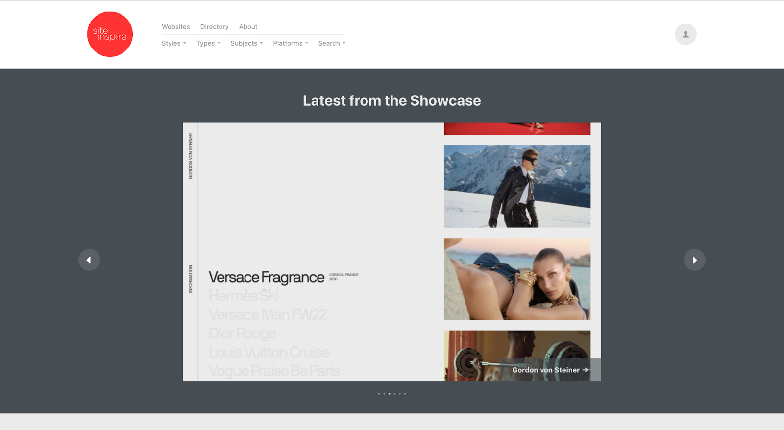
Freelance web designers might need inspiration for specific industries or business fields. In this case, ‘siteInspire’, an international website boasting a vast website library, could be of help. With its broad tagging system, you can easily filter and search for the artwork you desire.
By using multiple tags at once, you can get search results closer to the type of web inspiration you want, and using various combinations can lead to interesting results.
Looking for Web Design Projects?
Elancer is Here to Help!
If you are a freelance web designer, you may be seeking projects that not only benefit your portfolio but also offer good collaboration conditions. Craft your profile and explore quality projects with the assistance of an Elancer manager.
Elancer’s Web Design Project Matching Process
Step 1 – Creating Your Profile
Your profile should include a detailed career description, portfolio, and other relevant information. A well-crafted profile plays a significant role in increasing the success rate of a project.
Step 2 – Consulting with the Manager After Applying for a Project
After you apply for a project, you will work with an Elancer manager throughout the remaining processes.
Step 3 – Meeting and Contracting
You will receive support from a dedicated manager for all the administrative tasks related to the contract.
Step 4 – Progress and Completion of the Project
From the start to the finish of the project, you can receive service support from Elancer if needed.

| Learn More: How to Register on Elancer and Get Matched with Projects / Types of Elancer Memberships