The Lasting Power of Imagery
Remember that diagram from your English lessons illustrating indefinite pronouns and adjectives?
It’s intriguing that we recall them even a decade after our school days. The secret? We understood them through “visualization”.
When conveying information, turning data into images not only eases understanding but also ensures it lingers in memory, enhancing its impact.
In fact, studies have validated that when educators harness imagery in their lessons, they amplify their teaching effectiveness manifold.
To provide perspective: when researchers delved into why Asian students consistently outscored their American peers in math, a fascinating pattern emerged.
Asian educators leveraged visuals or abstract concepts in their teaching about twice as often as their U.S. counterparts.
This strategy significantly influenced the math scores (Asia: 61%, U.S.: 31%).

Riding the Data Wave in the IT Age
As IT continues its rapid ascent, the potential of Big Data grows daily. Organizations everywhere are nodding in agreement about the importance of data.
However, mere volume doesn’t guarantee success; the real game-changer is how we utilize this data.

For an impactful data strategy, swift comprehension and effective communication are pivotal, allowing for precise conclusions and strategies.
The secret to enhancing your data analytics prowess?
Dive into Elancer’s Masterclass on
Optimal Data Representation!
Unraveling the Concept of Data Visualization

Organizations churn out heaps of data daily, from sales metrics and marketing KPIs to inventory details and customer interactions.
But sifting through these numeric heaps to uncover valuable insights can be daunting.
Enter “Data Visualization”, the art of representing data in formats like charts, graphs, and maps.
Leveraging this technique, organizations can swiftly discern patterns, trends, and relationships.
The payoff? Empowering teams with actionable insights, ready to fuel their business strategies.
Engage with Elancer, your trusted IT freelancer matching platform, to harness the transformative power of data visualization and supercharge your analytical prowess!
Why Data Visualization Matters in Business

1. Summarize Massive Data for Quick Insights
Organizations are constantly inundated with vast amounts of data. But can you discern meaningful trends or changes from a densely packed Excel sheet full of text and numbers?
It’s challenging. Especially when we talk about big data, the complexity multiplies.
By harnessing the power of data visualization, you can represent massive data sets in a concise and easily digestible format.
For instance, charts provide comparative insights by showing variations in the size of shapes, heights of graphs, or shades of colors.
This visualization highlights previously elusive key points, enabling you to derive valuable insights that mere text wouldn’t offer.
2. Enhance Data Utilization and Interaction
Data visualization isn’t just about passive viewing; it elevates data engagement.
With features like filtering, sorting, and zooming, interactive visualization tools empower team members to actively explore data and find the insights they need.
This is a distinct advantage over static infographics, which convey a singular, unchanging message about the data.
The interactivity in data visualization is not only its distinguishing factor but also its strength.
3. Strengthen Data-Driven Decision-Making Capabilities
The motive behind using data visualization is to uncover and comprehend the hidden significance in your data, leading to the derivation of pertinent insights.
The value of data doesn’t lie in its sheer volume, but in how adeptly it’s utilized, a testament to an organization’s capability.
There are two main applications for data visualization:
First, it is utilized during data analysis to derive insights. Since visuals are intuitively perceived and retained by humans, they become a potent medium for communication.
Second, these visual insights can then be shared across the organization. A prime example is the use of “dashboards”, which amalgamate various charts, graphs, and tables to monitor crucial Key Performance Indicators (KPIs).
These dashboards, armed with interactive features, offer users a hands-on experience in data exploration.
Organizations adept at leveraging data visualization effectively amplify their data-driven decision-making prowess.
Now, shall we delve into real-life applications of these principles in data visualization?
Unveiling Real-world Applications of Data Visualization
By understanding the significance and methods of data visualization, businesses can pioneer ahead, ensuring they are not just gathering data, but truly comprehending and harnessing it.
Let’s explore some tangible examples that bring these concepts to life.
Showcasing the Power of Data Visualization:
Real-world Implementation

P&G:
Procter & Gamble (P&G), the renowned multinational consumer goods company, harnesses the might of data visualization in its decision-making processes.
Given its global presence, the sheer volume of market and customer data they grapple with demands efficient data visualization.
P&G pioneered a unique concept called the “Business Sphere”, a dedicated space for data visualization.
Across 80 business locations worldwide, serving a massive clientele of over 4 billion, P&G has leveraged both internal metrics and external competitor data.
They process this vast pool into actionable insights, showcased on large screens at both headquarters and local subsidiaries.
This strategic move has halved their product launch cycles compared to competitors and doubled their market capitalization.
Data Visualization Tools to Elevate Your Game

Python: The Data Scientist’s Wand
If you’re into data science, Python is indispensable.
Recognized as a versatile programming language, Python specializes as an interactive data visualization tool. Its plethora of libraries makes it a potent ally for crafting graphs.
However, its downside is the necessity for programming skills, making it slightly less accessible for laypersons.
D3 (Data Drivened Document): Art Meets Data
D3, standing for ‘Data Drivened Document’, is a JavaScript-based library that crafts documents rooted in data.
D3.js employs HTML, SVG (Scalable Vector Graphics), and CSS to morph data into visual artistry.
Its major strength? A robust SVG processing capability. With D3, you can seamlessly map data to SVG attributes and integrate a myriad of tools and methods, from data processing to algorithms.
Google Looker Studio: Dashboard Mastery
Yearning for a tool that offers both data visualization and dashboards? Look no further than Google Looker Studio, a jewel in the Google Marketing Platform crown.
Users have the liberty to fashion various views of their data and dashboards.
What sweetens the deal? Seamless integration with Google Analytics, and both tools offer free versions for exploration.
Microsoft Power BI: Your Visual Companion
If a data dashboard solution is on your wishlist, the freely downloadable Microsoft Power BI comes highly recommended.
Users can indulge in its visual gallery and even sample visualizations without spending a dime.
Chartblocks: Brevity in Visualization
Chartblocks is a data visualization tool that crafts HTML5 statistical charts using JavaScript D3.js. It translates your data into charts akin to Excel.
Transform complex, number-laden information into intuitive visuals with Chartblocks, which boasts compatibility across devices and screen sizes.
Navigating the Intricacies of Data Visualization

Remember, harnessing data is an organizational feat. Misuse or misrepresentation of data visualization can lead to distortions, misinformation, and misunderstandings.
If a viewer fails to grasp visualized data, the value of big data diminishes. This underscores the need for specialized “data visualization experts”.
To quote Stephan Few, a luminary in the field, “There’s a vast chasm between those making decisions based on data and IT professionals providing the required data.” Bridging this gap is paramount for effective data visualization.
Engaging external experts for data visualization projects could arguably be the most strategic move, steering your business strategy and profits in the right direction.
Hire ‘Data Visualization Experts’ on Elancer!
Data visualization demands a diverse set of experts: data specialists, Python developers, backend developers, and UX/UI designers.
The crux of data visualization is “Handling data aptly.” While the role of data experts remains pivotal, developers are equally significant, especially when certain visualization tools demand programming expertise.
And to visually represent data with optimal design? You can’t overlook talented UX/UI and graphic designers.
To sidestep potential pitfalls in data visualization and ensure you achieve the best results, there’s no comparison to Elancer!
A platform home to ‘Top-tier Experts’, hire your ‘Data Visualization Specialist’ from Elancer!
Your Go-To Hub for Premium IT Freelancers
1. A Diverse Pool of IT Professionals Awaits
Discover Elancer, the pinnacle of IT freelance matching platforms. We’re proud to host an expansive community, with approximately 390,000 IT professionals from diverse specialties.
Whether you need Android, iOS, JAVA developers, Python experts to enhance operational efficiency, data specialists, UI/UX designers to revamp customer experience, or app/web designers, Elancer has it all.
Why jump between different platforms? At Elancer, we offer the cream of the crop, all under one roof.
2. Data-Driven Freelancer Matching: The Perfect Hire, Every Time
Heard about projects going awry due to a mismatched freelancer?
With Elancer, that’s in the past. Our platform dives deep into roughly 3.4 million freelancer reviews and 150 million service data points to ensure you get top-tier IT talents tailored to your needs.
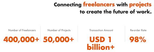
Through meticulous analysis, from a freelancer’s skill set to peer reviews, we boast an impressive project re-request rate of 98%. For a seamless freelancer hiring process, there’s no looking beyond Elancer.
3. Efficient Outsourcing with the Best Fee Structure in the Industry
Elancer stands unmatched in its fee structure, designed to give you the best value. With over two decades of industry presence, we’ve refined our approach.
Our analysis of 50,000 projects enables us to provide the most competitive commission rate, making it easier and more affordable for companies to tap into premium freelancing talent.
Our vast repository of data ensures a fee structure that’s unparalleled, offering unbeatable value. Initiate your project with Elancer and experience the zenith of outsourcing benefits.
Benefits You Won’t Find Anywhere Else…
Unlock these exclusive offerings only at the renowned IT freelance matching platform – Elancer.